Pediatric Trauma Learning Program
Through heuristic evaluation and usability test to test user tasks, examine interfaces and identify usability issues, give recommendations for improvement.
Introduction
Pediatric trauma learning program is produced by Gordon center. It is divided into five modules, including introduction, analysis and physiology, assessment, management and special considerations of pediatric trauma. It can be accessed directly through 5 separate links. At the same time, the learning program includes text descriptions, image illustrations, video explanations and content related audio explanations, as well as situational exercises. Me and my partner were asked to evaluate and redesign the website.
Heuristic Evaluation
Objectives
The purpose of this evaluation is to test the user task, check the interface and determine whether it conforms to the Nielsen's 10 usability heuristics. Find usability problems and put forward improvement suggestions.
Procedure
Browse and be familiar with the Gordon Center – Pediatric Trauma website.
Establish a spreadsheet template to determine all the tasks that users will perform, the type of problem, the UI focus of the problem, the persistence of the problem, problem location, the severity of each problem, the keepers' parts and improvement suggestions, and the usability heuristics violated.
Each evaluator inspect the interface alone and records the findings in the spreadsheet.
After the individual evaluation is completed, aggregate the data of the two evaluators, coordinate the problems found by the individual evaluator and calculate the average severity.
Finally, discuss and classify the problems, find the key problems according to severity, and get the improvement suggestion.
Roles
My partner and I both of us evaluated individually and aggregated and made the Heuristic Evaluation Report together.
Based on the website content, we compiled the main tasks to be evaluated, the types of usability issues, the UI focus, and the 10 heuristics to be referenced to begin our individual evaluation
Results
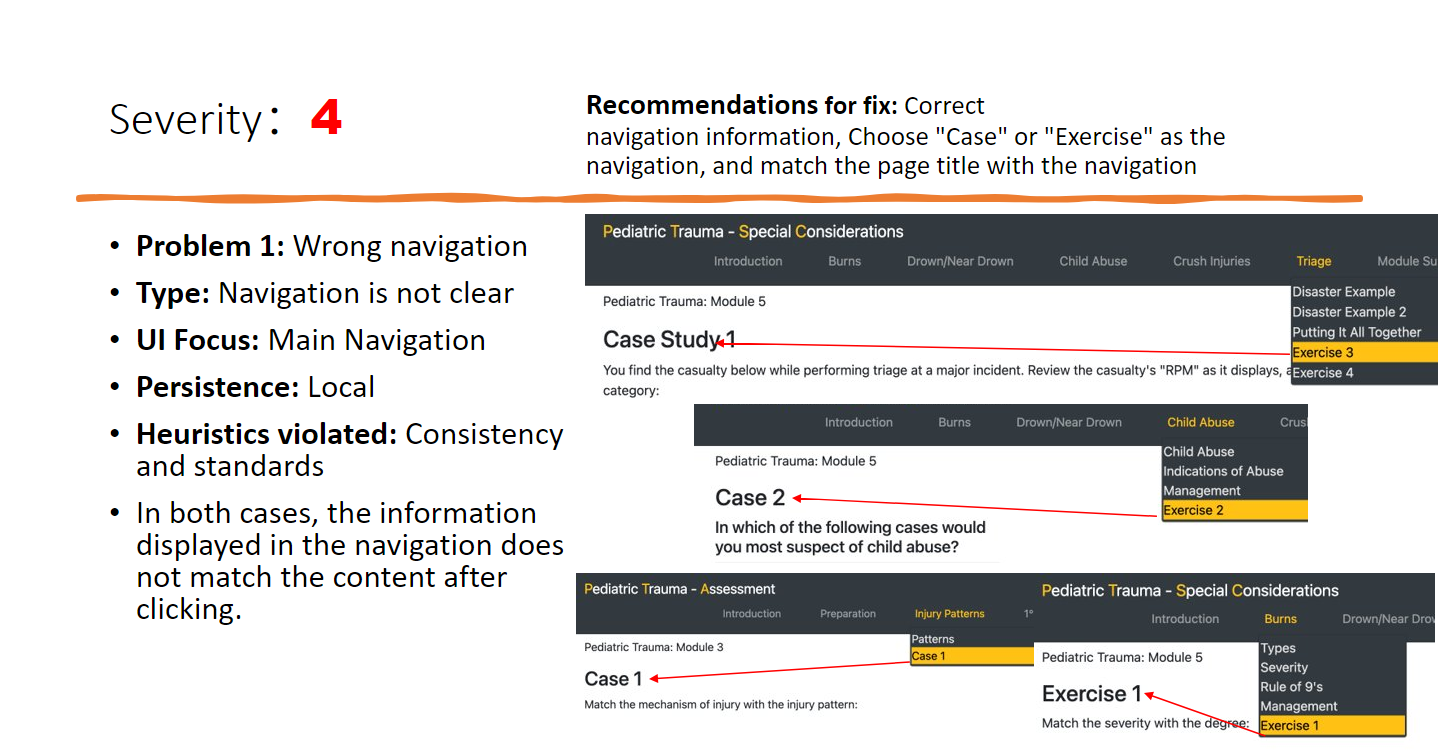
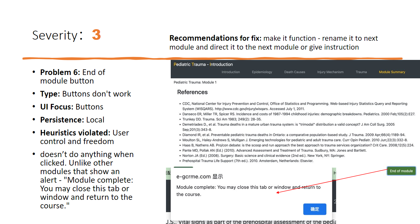
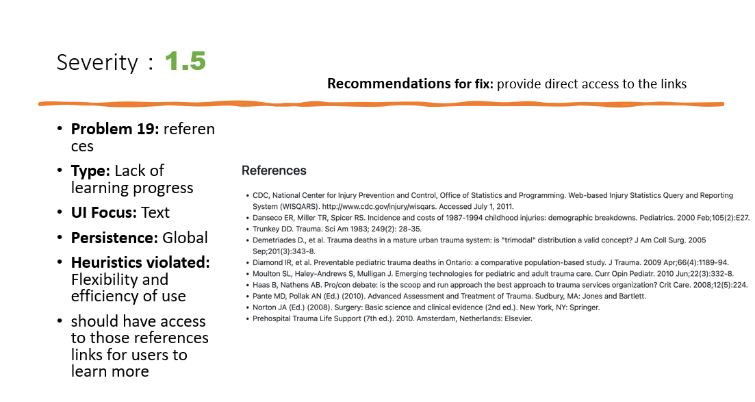
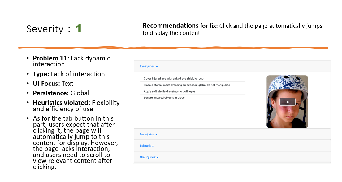
After individual evaluations we complied them both to find a total of 40 usability problems which were refined to delete similar problems, leaving us with a total of 30 usability problems. Once the website was evaluated, its problems were ranked according to Jakob Nielsen’s ten heuristics and severity rating scale of 0-4. During the process, we found the highest problem types were the navigation, the layout of the webpage and the interactions.
Individual Evaluation
Discovered Problems & Recommendations for fix
We analyzed the problems that emerged from the assessment into 10 categories and gave suggestions for improvement.
The full Heuristic Evaluation Report
Usability Test
Executive Summary
Then we conducted a usability test on the website. For this usability test, we evaluated the pediatric trauma learning program produced by Gordon center. The learning program is divided into five modules: introduction, anatomy and physiology, assessment, management and special considerations. This learning program contains text, images, audio, video and exercises. Users can read or watch relevant learning contents and apply the learned knowledge to practice.
Objectives
Through conducting this usability test, we want to learn the process of inviting real users in the target audience, also learn how to set typical tasks with specific scenarios based on the product which users need to complete.
In the real use process, we want to learn how to observe the actual operation of users, record and analyze the problems they encountered in using the product in detail, and find the usability problems existing in the product.
Finally we’re supposed to improve this product after collecting qualitative and quantitative data according to users’ advices and design guidelines, also determine the satisfaction of target users with the product.
Procedure
6 Gordon Center paramedics participated in the study.
Participants consented to participate and completed a demographic questionnaire.
Participants then completed 3 test tasks while thinking-aloud and answered post-task questions and surveys.
During the study, each participant was observed by the moderator and the observer as they took note of the tasks being conducted.
Tasks
Since the website is a learning program, the purpose of our test was to allow participants to navigate and use the program for simulated learning, requiring them to go through the entire process, viewing all elements of text, video, audio, etc. We set the tasks as 3, the first one was to quickly navigate the website, the second one was to complete the learning program and perform a simulated learning. Since there are 5 different modules, the last task is to browse another module to see if there are inconsistencies between modules.
Results
SUS Score
The research shows that the average sus score of different systems is 68, and our result is higher than 68, which indicates that this project has favorable perceived usability.
Keepers and Problems
Similarly, after testing we found 26 usability issues and grouped them into 5 categories, while finding 7 good features to keep.
Problems
Keepers
Redesign
Based on the problems found and recommendations for improvement, we redesigned this learning program.
Navigation: Having access to the entire learning process is very important – Linked all the modules together.
Audio: Change the audio button to a common form and combine text and audio transcript.
Text: Text style needed a change to highlight important data within the text using different colors, font size and bullet points.
Image: Many slides required a change of image due to either the image quality, lack of explanation, or they were unclear and unrelatable.
Case: Being a learning module, it required more case questions than provided – after each session there should be 2-3 questions.
Video: Some videos lacked content, some lacked indications, some videos just had an image with audio and the play button was not easily recognizable which is why a more consistent style of videos are required that offers.
Prototype
Images & Pop-up boxes
Pop-up Information
Introduction
Cases
Videos
Summary
The full Design Guideline
The full Usability Test Report
Reflection & Feedback
Results: The redesigned Pediatric Trauma Learning Program significantly improved the user experience, making it easier for paramedics to navigate and complete the learning modules. The usability issues identified were effectively addressed, and the platform now offers a more cohesive and intuitive learning environment.
Reflections: This project highlighted the importance of user-centered design and thorough usability testing in creating effective educational tools. By combining heuristic evaluation with usability testing, we were able to identify and resolve critical issues that improved the overall user experience.
Client Feedback: The director of the Gordon Center appreciated our recommendations and solutions, which were subsequently incorporated into the website, enhancing its effectiveness for its intended users.


